

ส่วนขยายการแสดงเป็นภาพ
ฟีเจอร์
ส่วนขยายการแสดงเป็นภาพ ทั้งหมด

Sankey
โดย Tableau
มีการนำแผนภาพ Sankey มาใช้เพื่อแสดงโฟลว์ของข้อมูลระหว่างหลายหมวดหมู่
Tableau Table
โดย Tableau
สร้างตารางที่ครบถ้วนสมบูรณ์ด้วยการจัดรูปแบบตามเงื่อนไขโดยตรงใน Tableau
Radial
โดย Tableau
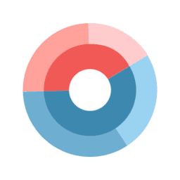
แสดงข้อมูลในรูปแบบวงกลม โดยผลรวมของค่าในทุกส่วนจะเท่ากับ 100%
Donut
โดย LaDataViz
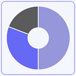
สร้างแผนภูมิ Donut ง่ายๆ โดยไม่ต้องใช้สูตรลัด!
Tree Diagram
โดย LaDataViz
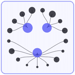
สร้างแผนผังต้นไม้แบบรัศมี แนวนอน หรือแนวตั้งที่สวยงาม
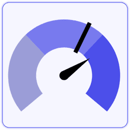
Gauge
โดย LaDataViz
สร้างเกจที่ปรับแต่งได้อย่างเต็มรูปแบบด้วยการลากแล้ววางเพียงครั้งเดียว
SuperTables
โดย Infotopics | Apps for Tableau
ช่วยให้ผู้ใช้วิเคราะห์และสำรวจข้อมูลเพื่อสนับสนุนการแสดงภาพของคุณด้วยตารางแบบอินเทอร์แอกทีฟ
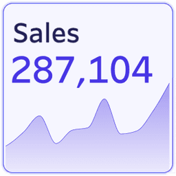
KPI Card (BANs)
โดย LaDataViz
สร้าง KPI Card ที่น่าทึ่งโดยไม่ต้องคำนวณใดๆ ในเวิร์กชีตเดียว!

Waterfall Chart
โดย Infotopics | Apps for Tableau
แผนภูมิน้ำตกแสดงผลสะสมของการเปลี่ยนแปลงตามลำดับตามค่าเริ่มต้นอย่างชัดเจน
PowerKPIs
โดย Infotopics | Apps for Tableau
ผสานรวมข้อมูลเชิงลึกลงในแดชบอร์ด Tableau ของคุณอย่างมีกลยุทธ์ด้วย PowerKPIs
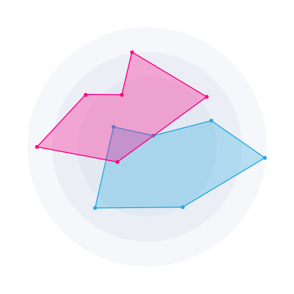
Radar Chart
โดย Infotopics | Apps for Tableau
วิธีการแสดงข้อมูลหลายตัวแปรในรูปแบบกราฟิกแบบแผนภูมิสองมิติข้อมูล

Sankey Diagram
โดย Infotopics | Apps for Tableau
แผนภาพ Sankey ที่ปรับแต่งได้สูงเพื่อแสดงภาพโฟลว์การวัดผลในหลายมิติข้อมูล
Radar
โดย LaDataViz
เปรียบเทียบประสิทธิภาพด้วยส่วนขยายแผนภูมิเรดาร์ที่สวยงามของเรา
Streamgraph
โดย LaDataViz
Display time-series data with a beautiful and engaging Streamgraph
DrillDownTree
โดย Infotopics | Apps for Tableau
แสดงเป็นภาพและรวบรวมข้อมูลจากมิติข้อมูลต่างๆ อีกทั้งดูรายละเอียดเจาะลึกในลำดับใดก็ได้
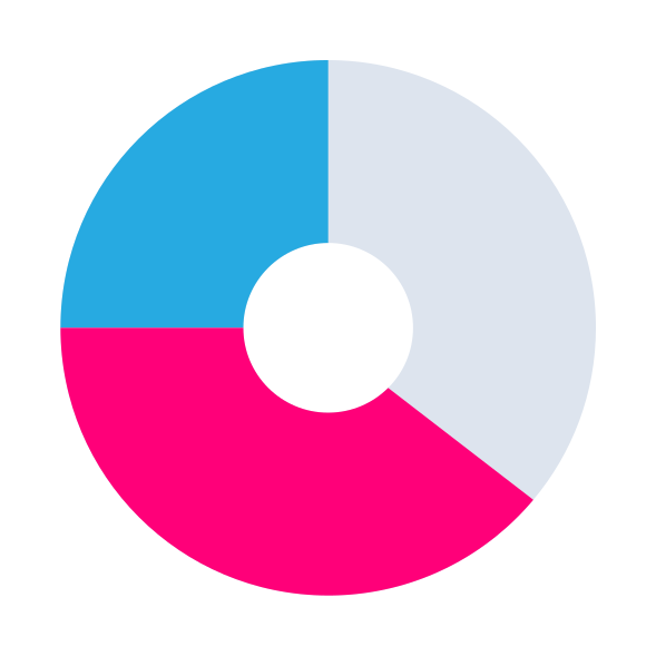
Zoomable Sunburst
โดย Infotopics | Apps for Tableau
การแสดงเป็นภาพแบบลำดับชั้นที่แสดงข้อมูลในเลย์เอาต์แบบรัศมี
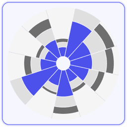
Polar Area / Nightingale
โดย LaDataViz
เปรียบเทียบขนาดอย่างสวยงามด้วยแผนภูมิพื้นที่ขั้วโลก (เรียกอีกอย่างว่า Coxcomb หรือ Nightingale Rose)
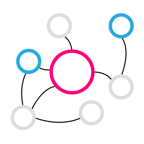
Network Diagram
โดย Infotopics | Apps for Tableau
แผนภาพเครือข่ายที่ปรับแต่งได้สูงช่วยให้ผู้ใช้เข้าใจความสัมพันธ์ของข้อมูล
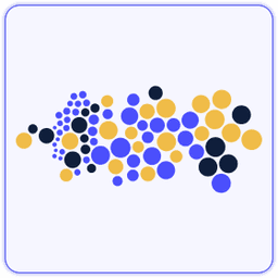
Beeswarm
โดย LaDataViz
แสดงการกระจายของข้อมูลด้วยแผนภูมิ Beeswarm

Sunburst (ซูมได้)
โดย Actinvision
แผนภาพ Sunburst ใช้เพื่อแสดงภาพข้อมูลแบบลำดับชั้นโดยใช้วงกลมตรงกลาง
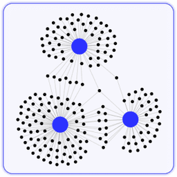
Network
โดย LaDataViz
แสดงความสัมพันธ์ที่ซับซ้อนด้วยส่วนขยายเครือข่ายที่ใช้งานง่ายของเรา

Heatmap
โดย Actinvision
Les cartes de chaleur permettent de visualiser les données à travers les variations de couleur
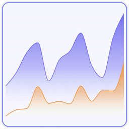
Line Chart
โดย LaDataViz
สร้างแผนภูมิเส้นที่สวยงามและทันสมัยด้วยรูปแบบต่างๆ (เส้นโค้ง พื้นที่ การไล่ระดับสี)

Venn Diagram
โดย Infotopics | Apps for Tableau
การแสดงกราฟิกที่ใช้เพื่อแสดงความสัมพันธ์ระหว่างเซตข้อมูลต่างๆ

Sankey - Draggable
โดย LaDataViz
สร้างแผนภาพ Sankey ที่สวยงามและย้ายโหนดไปรอบๆ เพื่อสร้างเลย์เอาต์ที่สมบูรณ์แบบสำหรับคุณ!

Radar
โดย Actinvision
Un graphique en radar hautement personnalisable
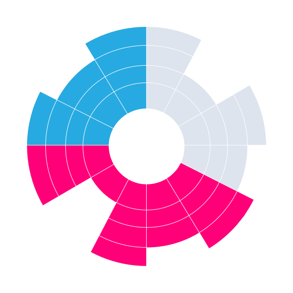
Sunburst Diagram
โดย Infotopics | Apps for Tableau
แสดงลำดับชั้นโดยผ่านชุดวงแหวน ซึ่งแบ่งออกตามแต่ละโหนดหมวดหมู่

Funnel
โดย Actinvision
Un graphique en entonnoir simple et personnalisable.
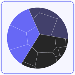
Voronoi Treemap
โดย LaDataViz
เพิ่มสีสันให้กับการแสดงภาพข้อมูลแบบลำดับชั้นด้วยแผนผังต้นไม้ Voronoi!

Recursive Sankey Diagram
โดย Infotopics | Apps for Tableau
แสดงภาพโฟลว์ชุดข้อมูลเฉพาะตั้งแต่จุดเริ่มต้นจนถึงปลายทาง

DashPets
โดย Infotopics | Apps for Tableau
แปลงข้อมูลให้กลายเป็นแมวน่ารัก สุนัขที่มีความสุข หรือ T-Rex สุดเท่ กรอง โต้ตอบ และสนุกได้เลย!
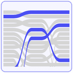
Bump Chart
โดย LaDataViz
ติดตามการเปลี่ยนแปลงอันดับได้อย่างง่ายดายด้วยแผนภูมิ Bump ที่น่าทึ่ง
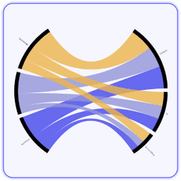
Radial Sankey
โดย LaDataViz
แสดงโฟลว์ระหว่างแหล่งที่มาและเป้าหมายใน Radial Sankey ที่สวยงาม

แผนภูมิรัศมี
โดย Actinvision
Un graphique radial à barres affichés sur des plans à coordonnées polaires.

Chord Diagram
โดย Infotopics | Apps for Tableau
แสดงให้เห็นความสัมพันธ์และการเชื่อมต่อระหว่างเอนทิตีในเครือข่ายหรือระบบ
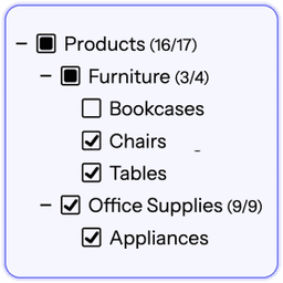
Drill Down Filter
โดย LaDataViz
เพิ่มเมนูตัวกรองแบบดรอปดาวน์ขั้นสูงลงในแดชบอร์ดของคุณภายในสองนาที
PictureThis Free
โดย Infotopics | Apps for Tableau
ส่วนขยาย PictureThis ช่วยให้คุณสร้างตาราง/การ์ดรูปภาพแบบไดนามิกตามข้อมูลของคุณ

Chord
โดย LaDataViz
แสดงภาพโฟลว์และการเชื่อมต่อได้อย่างง่ายดายด้วยส่วนขยายแผนภาพ Chord ของเรา

Waterfall & KPI Tree: What's driving my variations?
โดย DataMa
ค้นพบสาเหตุที่อยู่เบื้องหลังการเปลี่ยนแปลง KPI ของคุณด้วย Datama สำหรับ Tableau
Anomaly Detection
โดย DataMa
ค้นหาความผิดปกติในเส้นแนวโน้มสำหรับเมตริกและมิติข้อมูลต่างๆ ในเวลาเดียวกัน

Globe Path
โดย LaDataViz
แสดงเส้นโค้งแบบเคลื่อนไหวระหว่างจุดเริ่มต้นและจุดหมายปลายทางบนโลก 3 มิติที่หมุนได้

Circular Sankey Diagram
โดย Infotopics | Apps for Tableau
แสดงภาพโฟลว์การวัดผลในหลายมิติข้อมูลด้วยลูปภายใน

ตาราง
โดย Actinvision
Un affichage sous forme de table simple et efficace pour vos données.
Marginal Histogram
โดย Infotopics | Apps for Tableau
ให้ผู้ใช้แสดงภาพทั้งการกระจายและความสัมพันธ์ระหว่างตัวแปรในมุมมองเดียว

Funnel Chart
โดย Infotopics | Apps for Tableau
Funnel หลายมุมมองขนาดเล็กแบบยืดหยุ่นสำหรับดูความคืบหน้าตามขั้นตอน คอนเวอร์ชัน การจัดกลุ่ม และการติดตามเป้าหมาย
Assess Significance
โดย DataMa
ประเมินความสำคัญทางสถิติของความแตกต่างใน KPI ใดๆ ระหว่างสองจุดได้อย่างรวดเร็ว
ProcessMining Free
โดย Infotopics | Apps for Tableau
แสดงเป็นภาพและวิเคราะห์กระบวนการของคุณตามการแยกข้อมูลไฟล์บันทึก

Bullet
โดย Actinvision
L’extension ultra personnalisable pour graphiques à puces d’Actinvision
Gauge chart
โดย Infotopics | Apps for Tableau
แสดงเกจ KPI หนึ่งหรือหลายตัวด้วยรูปแบบรัศมี มาตรวัดความเร็ว หรือไฟจราจร

WriteBackExtreme Free
โดย Infotopics | Apps for Tableau
ทำงานร่วมกันโดยตรงจากแดชบอร์ด Tableau ของคุณด้วย WriteBackExtreme
Easy KPI Cards
โดย IP Faustov Aleksandr
สร้างการ์ด KPI ที่สวยงามและโต้ตอบได้ใน Tableau ได้ภายในเวลาเพียงไม่กี่วินาที

Calendar chart
โดย Infotopics | Apps for Tableau
แสดงค่าตามวันลงในตารางปฏิทินเพื่อเผยให้เห็นการผันแปรตามฤดูกาลและรูปแบบที่เปลี่ยนแปลงตามช่วงเวลา

Small Multiples
โดย Infotopics | Apps for Tableau
แสดงแผนภูมิเดิมซ้ำในแต่ละแผงเพื่อเปรียบเทียบแนวโน้มได้อย่างสม่ำเสมอและรวดเร็ว

Tree Diagram
โดย Infotopics | Apps for Tableau
แสดงภาพโครงสร้างการรายงานแบบลำดับชั้นด้วยรูปแบบการจัดวางที่ยืดหยุ่นและรายละเอียดในระดับโหนด
Area Bump
โดย LaDataViz
แสดงภาพการเปลี่ยนแปลงของอันดับและความโดดเด่นในหมวดหมู่เมื่อเวลาผ่านไป
KPI Card
โดย Eduard Nizamov
การ์ด KPI ที่มาพร้อมแผนภูมิแนวโน้มและการเปรียบเทียบช่วงเวลาโดยอัตโนมัติในตัว

Streamgraph
โดย Infotopics | Apps for Tableau
แสดงการเปลี่ยนแปลงขององค์ประกอบตามช่วงเวลาด้วยชุดข้อมูลแบบซ้อนที่เรียงต่อกันรอบเส้นกึ่งกลาง

HierarchyFilter
โดย Infotopics | Apps for Tableau
แทนที่ตัวกรองแดชบอร์ดหลายรายการด้วยตัวกรองตามลำดับชั้นที่ใช้งานง่ายเพียงรายการเดียว

Isotype
โดย Actinvision
Utilisez des images pour faire parler vos données

Horizon Chart
โดย Infotopics | Apps for Tableau
บีบอัดอนุกรมเวลาที่ยาวนานให้เป็นแถบข้อมูลขนาดกะทัดรัดเพื่อการเปรียบเทียบแนวโน้มที่หนาแน่น
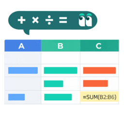
Spreadsheet
โดย DataMa
จัดการข้อมูลของคุณในสภาพแวดล้อมของ Spreadsheet ได้เหมือนกับใช้งาน Excel หรือ Google ชีต!
%20(1).png&w=256&q=75)
Dimensions & Metrics Explorer
โดย DataMa
ส่วนขยายนี้ช่วยให้สามารถเจาะลึกรายละเอียด KPI แบบโต้ตอบได้ โดยรองรับมุมมองที่หลากหลายทั้งในด้านมิติข้อมูลและเมตริก

Date Picker
โดย Actinvision
มุ่งเน้นช่วงเวลาที่เฉพาะเจาะจงหรือเปรียบเทียบช่วงเวลาที่แตกต่างกันได้ง่ายๆ
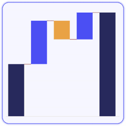
Waterfall
โดย LaDataViz
สร้างแผนภูมิ Waterfall ที่สวยงามและทันสมัย พร้อมแสดงผลรวมสะสม ผลรวมย่อย และเป้าหมาย
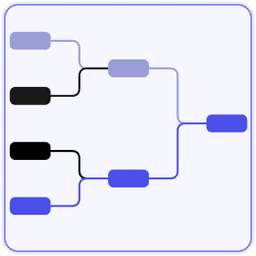
Tournament Bracket
โดย LaDataViz
สร้างผังการแข่งขันสไตล์ทัวร์นาเมนต์ที่สวยงาม เพื่อติดตามความคืบหน้าของทีมโปรดของคุณ

Nightingale+
โดย Actinvision
Visualisation circulaire qui met en évidence la magnitude relative des catégories

KPI Card
โดย KLIMN
เมตริกหลักที่แสดงการเปรียบเทียบช่วงเวลา เส้นสปาร์กไลน์แสดงแนวโน้ม และการจัดรูปแบบตัวเลขอารบิกแบบ RTL อย่างสมบูรณ์

Heatmap
โดย KLIMN
แผนที่ความหนาแน่นแบบแถวกับคอลัมน์ รวมถึงโหมดตารางปฏิทินที่รองรับเดือนตามปฏิทินฮิจเราะห์แบบดั้งเดิม

Donut Chart
โดย KLIMN
แผนภูมิวงกลมรูปโดนัทและพายที่สามารถแสดงค่า KPI เพิ่มเติมไว้ตรงกลางได้ ช่วยให้เห็นภาพความสัมพันธ์ของส่วนประกอบเทีย...

HierarchyFilter
โดย Infotopics | Apps for Tableau
แทนที่ตัวกรองแดชบอร์ดหลายรายการด้วยตัวกรองตามลำดับชั้นที่ใช้งานง่ายเพียงรายการเดียว

Bar Chart
โดย KLIMN
แผนภูมิแท่งที่จัดกลุ่มและซ้อนกันที่รองรับ RTL ในตัวมาตั้งแต่ต้น

FinanceTables
โดย Infotopics | Apps for Tableau
การรายงานทางการเงินที่รองรับมาตรฐาน IBCS ภายใน Tableau โดยตรง
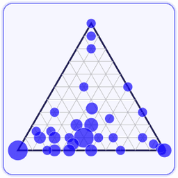
Ternary Plot
โดย LaDataViz
วางข้อมูลสามส่วนบนรูปสามเหลี่ยมเพื่อดูว่าแต่ละเครื่องหมายแบ่งออกเป็นสามหมวดหมู่อย่างไร
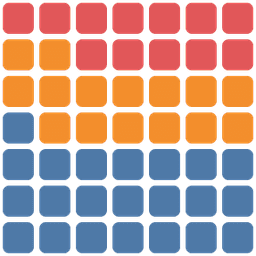
Waffle Chart
โดย Dataskera
สัดส่วนของข้อมูลแต่ละหมวดหมู่ในรูปแบบตารางช่องสี่เหลี่ยมสีต่างๆ ซึ่งช่วยให้สามารถเปรียบเทียบสัดส่วนย่อยกับภาพรวมท...

Combo Chart
โดย KLIMN
แผนภูมิผสมแบบแท่งและเส้นที่มีแกนคู่ สำหรับเปรียบเทียบค่าจริงกับเป้าหมายโดยใช้แกนเวลาเดียวกัน

Sunburst
โดย KLIMN
วงแหวนแบบซ้อนกันจากส่วนย่อยไปหาส่วนรวมสำหรับลำดับชั้นแบบหลายระดับ พร้อมรองรับการแสดงผลแบบ RTL และตัวเลขเปอร์เซ็นต...

Error Bars
โดย Actinvision
Error Chart จะแสดงค่าต่างๆ และค่าความไม่แน่นอน เพื่อแสดงภาพของค่าเบี่ยงเบนไปและช่วงความเชื่อมั่น

Line Chart
โดย KLIMN
แผนภูมิเส้นและแผนภูมิพื้นที่แสดงข้อมูลอนุกรมเวลา พร้อมแกนที่รองรับปฏิทินฮิจเราะห์แบบดั้งเดิม

3D Scatter Plot
โดย Dataskera
สำรวจค่าการวัดผล 3 ค่าไปพร้อมกันในแผนภาพการกระจายแบบ 3 มิติเชิงโต้ตอบที่คุณสามารถหมุนและซูมได้

Radial Bar Chart
โดย Dataskera
เปรียบเทียบหมวดหมู่ในเลย์เอาต์วงกลม

Hierarchy Table
โดย KLIMN
ตารางแบบลำดับชั้นที่ขยายได้พร้อม RTL แบบอาหรับดั้งเดิม ช่วงเวลาตามปฏิทินฮิจเราะห์ และการสนับสนุนลำดับชั้นที่ไม่สม...

Bullet Chart
โดย KLIMN
แผนภูมิสัญลักษณ์หัวข้อย่อยที่แสดงค่าจริงเทียบกับเป้าหมาย พร้อมแถบระดับผลการดำเนินงานเชิงคุณภาพ โดยยึดตามหลักการขอ...
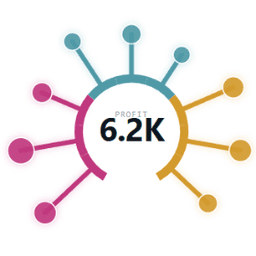
Radial Spike Chart
โดย TableauOps
แผนภูมิรูปอมยิ้มแบบวงกลมสำหรับ Tableau: ขายื่นออกไปรอบๆ แถบโค้งมีสี

Sankey
โดย KLIMN
แผนภาพแสดงโฟลว์ตามสัดส่วนระหว่างหมวดหมู่ พร้อมทิศทางโฟลว์จากขวาไปซ้ายในรูปแบบ RTL อย่างแท้จริง

EasyTables
โดย Eduard Nizamov
ตารางแบบ Self-service พร้อมการจัดกลุ่ม Pivot และการจัดรูปแบบ

graphomate chartrix
โดย graphomate GmbH
graphomate chartrix คือองค์ประกอบแผนภูมิใหม่ของเราที่ได้รับการรับรองมาตรฐาน IBCS®