

Radial Spike Chart
โดย TableauOps
ฟรี
คำอธิบาย
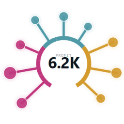
Radial Spike Chart เปลี่ยนเวิร์กชีตให้เป็นแผนภูมิรูปอมยิ้มแบบวงกลม โดยมีหนึ่งขาต่อหนึ่งรายการ และกระจายอยู่เท่าๆ กันรอบๆ ส่วนโค้งพื้นฐานที่เปิดที่ด้านล่าง แต่ละขาจะยื่นออกไปด้านนอกตามสัดส่วนของค่าที่วัดได้ โดยมีฟองเสริมที่ขนาดพื้นที่ส่วนปลายเป็นไปตามการวัดผลครั้งที่สอง จึงแสดงสองปริมาณต่อรายการ และสามารถอ่านได้อย่างรวดเร็ว
การกำหนดรหัสบนการ์ดเครื่องหมาย
- รายการ: หนึ่งมิติข้อมูลขึ้นไป (รวมกันไม่เกิน 8 มิติข้อมูล) หนึ่งขาต่อค่า
- ความยาว: แต่ละขาอยู่ห่างจากส่วนโค้งแค่ไหน
- ขนาด (ไม่บังคับ): ปรับขนาดพื้นที่ของฟองที่ปลายขา
- สี (ไม่บังคับ): เติมสีขาและแถบส่วนโค้ง ค่าการวัดผลจะมีทางลาดต่อเนื่อง โดยใช้หนึ่งสีต่อค่า
สร้างมาเพื่อใช้ในแดชบอร์ดจริง
- การคลิกที่ขาจะเป็นการเลือกเครื่องหมายที่อยู่ด้านล่าง ดังนั้นการดำเนินการกรองและไฮไลต์จึงเริ่มทำงานเหมือนกับแผนภูมิแบบเนทิฟ
- การวางเมาส์เหนือจะแสดงเคล็ดลับเครื่องมือและการอ่านข้อมูลตรงกลาง หมายเลขตรงกลางจะเป็นของเครื่องหมายที่ใหญ่ที่สุดตามค่าเริ่มต้น
- กำหนดค่าเมนู: ทำเครื่องหมายสีด้วยตัวอย่างที่กำหนดไว้ล่วงหน้า ขนาดขาและฟอง ช่วงส่วนโค้ง (180–360°) ลำดับการจัดเรียง (จัดกลุ่มตามสี ยาวที่สุด สั้นที่สุด ตามที่โหลด) ทิศทาง ตัวเลือกป้ายกำกับ และการสลับการแสดงผลฟองเคล็ดลับ ทั้งหมดนี้จะบันทึกไว้ในเวิร์กบุ๊ก
- เติมสีในโซนตามการเปลี่ยนแปลง นำป้ายกำกับและคำอธิบายออกเมื่อมีขนาดเล็ก ไม่ต้องเลื่อนดู
ทำงานได้อย่างสมบูรณ์ภายใน Tableau - ไม่มีข้อมูลใดๆ ออกจากเบราว์เซอร์ของคุณ และไม่จำเป็นต้องลงชื่อสมัครใช้ เริ่มต้นอย่างรวดเร็วด้วย Superstore: หมวดหมู่ย่อย → รายการ, ผลรวม(การขาย) → ความยาว, ผลรวม(กำไร) → ขนาด, หมวดหมู่ → สี
ข้อมูลจำเพาะทางเทคนิค
- โฮสต์ที่
- https://ext.tableauops.com/u/tableauops/radial-spike/
- ทำงานร่วมกับ
- Tableau เวอร์ชัน 2024.2 และใหม่กว่า
แหล่งข้อมูล
เว็บไซต์นักพัฒนานโยบายความเป็นส่วนตัวข้อกำหนดในการให้บริการ
Download and start your free trial of Tableau today.
Try Tableau Now