Network 2.0
依據 LaDataViz
可用
描述
引入 Tableau 網路擴充功能
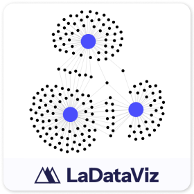
使用 Tableau 的網路圖表擴充功能來提升分析能力,這是一款功能強大的視覺化工具,旨在突出顯示資料中的連線和關係。此擴充功能無縫整合到 Tableau 中,讓使用者可以建立詳細的互動式網路圖,揭示複雜系統的基礎結構。
The Network 2.0 包括多項新更新:
- 新色彩標記卡,可在您的資源、目標或二者中新增色彩!
- 使用欄位改變連結大小的能力
- 為來源和目標大小使用不同欄位的選項
為什麼選擇網路圖表? 網路圖表對於探索和呈現實體之間的關係非常有價值,無論它們是社群網路中的個體、基礎設施中的元件還是資料結構中的項目。這些圖表提供互連的視覺化地圖,幫助使用者了解資料點如何互動和相互影響。
網路圖擴充功能的功能:
- 全面視覺效果: 以易於理解且具有視覺吸引力的格式顯示複雜的關係和網路結構。
- 動態互動性: 使用縮放、平移和可按式節點等功能探索網路,這些功能可深入了解連線的具體細節。
- 無縫整合: 在 Tableau 生態系統中流暢執行,透過先進的網路視覺效果功能增強現有的儀表板。
- 高可自訂性: 調整節點大小、邊緣厚度、顏色等,以滿足簡報的美學需求或突出顯示資料的特定方面。
該工具非常適合資料分析師、研究人員和商業智慧專業人士,它可以讓您更深入地了解關係動態,有助於根據全面的視覺化證據推動策略決策。
保持聯絡!我們每週會傳送有關視覺效果擴充功能和其他工具的更新:https://newsletter.ladataviz.com/
- 網站:https://www.ladataviz.com
- Twitter/X:https://twitter.com/ladataviz
- Youtube:https://www.youtube.com/@ladataviz
- LinkedIn:https://www.linkedin.com/in/ladataviz/
- 所有其他連結:https://linktr.ee/ladataviz
技術規格
- 托管位置
- https://extensions.ladataviz.com/network_v2?licenseKey=free
- 適用於
- Tableau 2024.2 及更新版