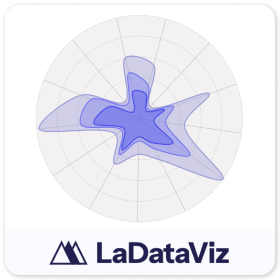
Radar 2.0
依據 LaDataViz
描述
在 Tableau 中引入雷達圖 2.0
使用 Tableau 雷達圖擴充功能來提升資料視覺效果工具組,該擴充功能旨在提供多變量資料的全面檢視。此擴充功能與 Tableau 無縫整合,可建立詳細的雷達(或編目程式),非常適合比較資料集中一個或多個群組的多個變數。
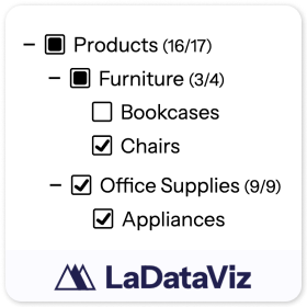
此新版本新增了色彩標記類型,讓您可以選擇簡單地使用詳細資訊分解檢視或新增色彩。
為什麼使用雷達圖? 雷達圖對於以易於比較和對比的方式顯示多個區域的效能指標特別有用。這樣 Viewer 就能夠一目了然地快速評估優勢和劣勢,非常適合基準、技能評估或需要直觀總結不同類別的相對效能的任何情境。
雷達圖擴充功能的功能:
- 多維度比較: 在有凝聚力的圖表中展示涵蓋多個變數的資料,從而可以輕鬆比較不同的實體或時間段。
- 互動式探索: 使用者可以與圖表互動以專注於特定的資料點或指標,透過向下鑽研功能來增強理解。
- 無縫整合: 專為完美適應 Tableau 環境而設計,透過進階視覺效果功能增強儀表板。
- 可自訂設計: 使用色彩、比例和軸選項修改圖表,以滿足特定的資料視覺效果需求。
透過 Tableau 雷達圖擴充功能,可以將複雜的多維度資料轉換為清晰、可動作的見解。該工具非常適合人力資源效能評估、產品比較或任何需要全面了解多個變數的分析情境,有助於以視覺上引人入勝且資訊豐富的方式讓資料栩栩如生。
保持聯絡!我們每週會傳送有關視覺效果擴充功能和其他工具的更新:https://newsletter.ladataviz.com/
- 網站:https://www.ladataviz.com
- Twitter/X:https://twitter.com/ladataviz
- Youtube:https://www.youtube.com/@ladataviz
- LinkedIn:https://www.linkedin.com/in/ladataviz/
- 所有其他連結:https://linktr.ee/ladataviz
技術規格
- 托管位置
- https://extensions.ladataviz.com/radar_v2?licenseKey=free
- 適用於
- Tableau 2024.2 及更新版
資源
更多的 LaDataViz 內容
.png&w=256&q=75)
Sankey - Draggable
依據 LaDataViz
建立精美 Sankey 圖並移動節點以建立完美版面配置!

Tree Diagram 2.0
依據 LaDataViz
將資料轉換為美觀且富有見解的放射、水平或垂直樹狀圖。
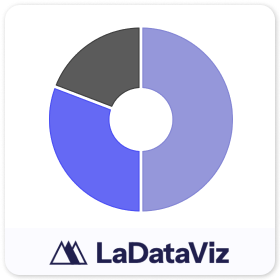
Donut
依據 LaDataViz
無需任何技巧即可建立環圈圖!
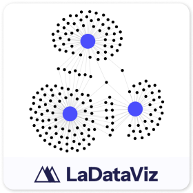
Network 2.0
依據 LaDataViz
將資料轉化為美觀且富有見解的網路圖。
Tree Diagram
依據 LaDataViz
將資料轉換為美觀且富有見解的放射、水平或垂直樹狀圖。
Drill Down Filter - Demo
依據 LaDataViz
兩分鐘內可在您的儀表板中新增進階下拉式篩選選單
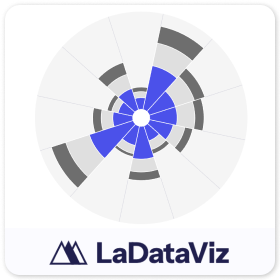
Polar Area Chart
依據 LaDataViz
將資料轉換為精美且富有見解的極座標圓餅圖(雞冠花 / 南丁格爾玫瑰)

Bump Chart
依據 LaDataViz
將資料轉化為美麗且富有見解的凹凸貼圖。
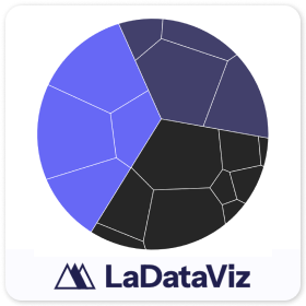
Voronoi Treemap
依據 LaDataViz
將資料轉化為美麗且富有見解的 Voronoi 樹狀圖。

Chord Diagram
依據 LaDataViz
將資料轉化為美麗且富有見解的弦圖。

Radar
依據 LaDataViz
將資料轉化為美麗且富有見解的雷達圖。
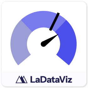
Gauge
依據 LaDataViz
將資料轉化為美麗且富有見解的量測計。

Beeswarm
依據 LaDataViz
將資料轉化為美麗且富有見解的 Beeswarm。
Streamgraph
依據 LaDataViz
將資料轉化為美麗且富有見解的 Streamgraph。

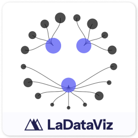
Network
依據 LaDataViz
將資料轉化為美麗且富有見解的網路圖。
Radial Sankey
依據 LaDataViz
將資料轉化為美麗且富有見解的放射 Sankey。