
Radar 2.0
按 LaDataViz
描述
介绍适用于 Tableau 的 Radar Chart 2.0
使用适用于 Tableau 的 Radar Chart 扩展程序提升您的数据可视化工具包,旨在提供多元数据的全面视图。此扩展程序与 Tableau 无缝集成,创建详细的雷达(或蜘蛛)图,这是比较数据集内一个或多个组的多个变量的理想选择。
这个新版本添加了一个新的颜色标记类型,允许您在简单地分解视图细节或添加颜色之间进行选择。
为什么选择雷达图? 雷达图对于以易于比较和对比的方式显示多个领域的性能指标特别有用。它们让查看者一眼就能快速判断优势和劣势,非常适合基准测试、技能评估或任何需要直观总结各种类别相对表现的场景。
Radar Chart 扩展程序的特点:
- 多维比较: 在一个完整的图表中展示涵盖多个变量的数据,便于比较不同的实体或时间段。
- 交互式探索: 用户可以与图表进行交互,以关注特定的数据点或指标,通过向下钻取功能增强理解。
- 无缝集成: 旨在完美适应 Tableau 环境,通过高级可视化功能增强您的仪表板。
- 可定制的设计: 使用颜色、比例和轴选项修改图表,以满足您特定的数据可视化需求。
借助适用于 Tableau 的 Radar Chart 扩展程序,您可以将复杂的多维数据转化为清晰、可行的见解。此工具是 HR 绩效评估、产品比较或任何需要全面了解多个变量的分析场景的理想选择,有助于以视觉上引人入胜和信息丰富的方式让您的数据栩栩如生。
保持联系! 我们每周都会发送关于可视化项扩展程序和其他工具的更新: https://newsletter.ladataviz.com/
- 网站: https://www.ladataviz.com
- Twitter/X: https://twitter.com/ladataviz
- Youtube: https://www.youtube.com/@ladataviz
- LinkedIn: https://www.linkedin.com/in/ladataviz/
- 所有其他链接: https://linktr.ee/ladataviz
技术规范
- 托管位置
- https://extensions.ladataviz.com/radar_v2?licenseKey=free
- 适用于
- Tableau 2024.2 及更高版本
资源
更多内容由 LaDataViz 提供
.png&w=256&q=75)
Sankey - Draggable
按 LaDataViz
创建美观的桑基图并移动节点来创建您的完美布局!

Tree Diagram 2.0
按 LaDataViz
将您的数据转换成美观且有洞察力的径向、水平或垂直树形图。
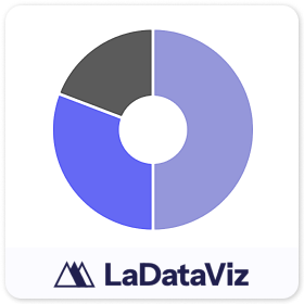
Donut
按 LaDataViz
无需任何破解即可创建圆环图!

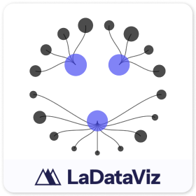
Network 2.0
按 LaDataViz
将您的数据转换成美观而有见解的网络图。
Tree Diagram
按 LaDataViz
将您的数据转换成美观且有洞察力的径向、水平或垂直树形图。

Drill Down Filter - Demo
按 LaDataViz
在两分钟内将高级下拉筛选器菜单添加到您的仪表板

Polar Area Chart
按 LaDataViz
将您的数据转换成一个美观而有洞察力的极坐标面积图(Coxcomb/Nightingale Rose)

Bump Chart
按 LaDataViz
将您的数据转换成一个美观而有洞察力的凹凸图。
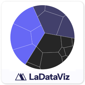
Voronoi Treemap
按 LaDataViz
将您的数据转换成美观且有洞察力的 Voronoi 树图。

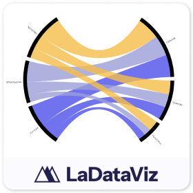
Chord Diagram
按 LaDataViz
将您的数据转换成美观而有洞察力的弦图。

Radar
按 LaDataViz
将您的数据转换成美观而有洞察力的雷达图。
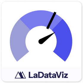
Gauge
按 LaDataViz
将您的数据转换为美观且富有洞察力的仪表。

Beeswarm
按 LaDataViz
将您的数据转化为美观而有见解的蜂群图。
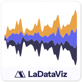
Streamgraph
按 LaDataViz
将您的数据转换为美观而富有见解的流图。

Network
按 LaDataViz
将您的数据转换成美观而有见解的网络图。
Radial Sankey
按 LaDataViz
将您的数据转换成美观而有见解的径向桑基图。