

방사형 스파이크 차트
작성자: TableauOps
무료
설명
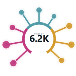
방사형 스파이크 차트는 워크시트를 극좌표형 막대사탕 차트로 바꿉니다. 각 항목당 하나의 스파이크가 아래쪽이 열린 기준 호를 따라 균등하게 배치됩니다. 각 스파이크는 측정값에 비례해 바깥쪽으로 뻗어 나가며, 끝에는 선택적으로 두 번째 측정값에 따라 면적 크기가 정해지는 버블을 표시할 수 있습니다. 즉, 항목당 두 개의 값을 한눈에 읽을 수 있습니다.
마크 카드의 인코딩
- 항목: 하나 이상의 차원(최대 8개 조합), 값당 하나의 스파이크
- 길이: 각 스파이크가 호에서 뻗어 나가는 거리
- 크기(선택 사항): 스파이크 끝부분의 버블 면적 크기
- 색상(선택 사항): 스파이크와 호의 띠 색상 지정, 측정값은 연속형 그라데이션으로, 차원은 값마다 다른 색상으로 표시
실제 대시보드에 맞게 제작
- 스파이크를 클릭하면 해당 마크가 선택되므로 기본 차트처럼 필터 및 하이라이트 동작이 실행됨
- 마우스오버하면 도구 설명과 가운데 값 표시가 나타나며, 기본적으로 가운데 숫자에는 가장 큰 마크가 표시됨
- 메뉴 구성: 사전 설정된 견본을 통한 마크 색상, 스파이크 및 버블 크기, 호 범위(180~360°), 정렬 순서(색상별 그룹화, 가장 긴 순, 가장 짧은 순, 로드된 순서), 방향, 레이블 옵션, 끝 버블 표시 여부를 설정할 수 있으며 모든 설정은 통합 문서와 함께 저장됨
- 영역을 반응형으로 채우고, 크기가 작을 때는 레이블과 범례를 표시하지 않으며, 스크롤을 생성하지 않음
Tableau 내에서만 작동하며, 데이터가 브라우저 외부로 전송되지 않고, 가입이 필요하지 않습니다. 슈퍼스토어로 빠르게 시작하려면 하위 범주 → 항목, 합계(매출) → 길이, 합계(수익) → 크기, 범주 → 색상으로 지정합니다.
기술 사양
- 호스팅되는 위치
- https://ext.tableauops.com/u/tableauops/radial-spike/
- 지원 대상
- Tableau 2024.2 이상