비주얼리제이션 확장 프로그램
기능
전체 비주얼리제이션 확장 프로그램

Sankey
작성자: Tableau
생키 다이어그램은 여러 범주 간의 데이터 흐름을 표시하는 데 사용됩니다.

Tableau Table
작성자: Tableau
Tableau에서 바로 조건부 서식 지정으로 풍부한 테이블 환경을 만들 수 있습니다.

Radial
작성자: Tableau
Displays data in a circular format in which the total of all segment values add up to 100%.

Donut
작성자: LaDataViz
복잡한 조작 없이 만들 수 있는 도넛 차트

Tree Diagram
작성자: LaDataViz
멋진 방사형, 수평 또는 수직 트리 다이어그램 작성

Gauge
작성자: LaDataViz
단 한 번의 끌어 놓기로 완벽하게 사용자 지정 가능한 게이지 차트 작성
SuperTables
작성자: Infotopics | Apps for Tableau
사용자가 데이터를 분석하고 탐색하여 멋진 대화형 테이블로 비주얼리제이션을 보강할 수 있습니다.

Radar Chart
작성자: Infotopics | Apps for Tableau
다변수 데이터를 2차원 차트 형태로 표시하는 그래픽 방식
PowerKPIs
작성자: Infotopics | Apps for Tableau
Integrieren Sie mit PowerKPIs strategische Erkenntnisse in Ihre Tableau Dashboards

Waterfall Chart
작성자: Infotopics | Apps for Tableau
폭포형 차트는 시작 값에 대한 순차적 변경의 누적 효과를 시각적으로 보여줍니다.

KPI Card (BANs)
작성자: LaDataViz
단일 워크시트에서 계산 없이 만들 수 있는 멋진 KPI 카드
Sankey Diagram
작성자: Infotopics | Apps for Tableau
고도로 사용자 지정 가능한 생키 다이어그램을 사용하여 여러 차원에 걸쳐 측정값의 흐름을 시각화하십시오.

Radar
작성자: LaDataViz
성과 비교에 유용한 멋진 Radat Chart 확장 프로그램

Streamgraph
작성자: LaDataViz
아름답고 매력적인 스트림그래프로 표현하는 시계열 데이터
DrillDownTree
작성자: Infotopics | Apps for Tableau
여러 차원에서 데이터를 시각화하고 집계할 수 있으며 원하는 순서로 드릴다운할 수 있습니다.

Zoomable Sunburst
작성자: Infotopics | Apps for Tableau
방사형 레이아웃으로 데이터를 나타내는 계층적 비주얼리제이션

Polar Area / Nightingale
작성자: LaDataViz
Coxcomb 또는 Nightingale Rose라고도 하는 극좌표 영역 차트를 사용한 효과적인 차원 비교
Sunburst(zoomable)
작성자: Actinvision
Sunburst 다이어그램은 동심원을 사용하여 계층적 데이터를 시각화하는 데 사용됩니다.

Network Diagram
작성자: Infotopics | Apps for Tableau
사용자가 데이터의 관계를 이해할 수 있게 해주는 고도로 사용자 지정 가능한 네트워크 다이어그램입니다.

Beeswarm
작성자: LaDataViz
벌떼 차트를 사용하여 표현하는 데이터 분포
Heatmap
작성자: Actinvision
다양한 색상을 통해 데이터를 시각화하는 히트 맵

Network
작성자: LaDataViz
사용하기 쉬운 네트워크 확장 프로그램으로 복잡한 관계 표시

Venn Diagram
작성자: Infotopics | Apps for Tableau
데이터 집합 간의 관계를 설명하는 데 사용되는 그래픽 표현입니다.

Line Chart
작성자: LaDataViz
곡선, 영역, 그라데이션 등 다양한 스타일로 아름답고 현대적인 라인 차트 만들기
Radar
작성자: Actinvision
고도로 사용자 지정 가능한 레이더 차트

Sankey - Draggable
작성자: LaDataViz
멋진 생키 다이어그램을 만들고 노드를 이동하여 완벽한 레이아웃 구축
Funnel
작성자: Actinvision
간단하고 사용자 지정 가능한 깔때기 차트입니다.

Sunburst Diagram
작성자: Infotopics | Apps for Tableau
각 범주 노드별로 분할된 일련의 링을 통해 계층 구조를 보여줍니다.

Voronoi Treemap
작성자: LaDataViz
보로노이 트리맵을 사용하여 계층적 데이터를 시각화하는 방식에 변화를 주십시오!
Radial Chart
작성자: Actinvision
방사형 차트는 단순히 극좌표 평면에 표시되는 막대 차트를 나타냅니다.
Recursive Sankey Diagram
작성자: Infotopics | Apps for Tableau
특정 데이터 집합의 원본에서 대상까지의 흐름을 시각화합니다.
DashPets
작성자: Infotopics | Apps for Tableau
데이터를 귀여운 고양이, 행복한 강아지, 멋진 티라노로 바꿔보십시오. 필터링하고 상호 작용하고 즐기십시오!

Bump Chart
작성자: LaDataViz
멋진 Bump Chart로 순위 변동을 손쉽게 추적

Radial Sankey
작성자: LaDataViz
방사형 생키로 세련되게 표현할 수 있는 원본과 대상 간의 흐름

Chord Diagram
작성자: Infotopics | Apps for Tableau
네트워크 또는 시스템에서 엔터티 간의 관계와 연결을 이미지로 설명합니다.
PictureThis Free
작성자: Infotopics | Apps for Tableau
Picture This 확장 프로그램을 사용하면 데이터를 기반으로 동적 이미지 테이블/카드를 만드는 데 도움이 됩니다.

Drill Down Filter
작성자: LaDataViz
대시보드에 고급 드롭다운 필터 메뉴를 2분 만에 추가

Chord
작성자: LaDataViz
흐름과 연결을 쉽게 시각화하는 Chord Diagram 확장 프로그램
Waterfall & KPI Tree: What's driving my variations?
작성자: DataMa
Tableau용 Datama를 사용하여 KPI 변화의 이유 파악
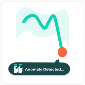
Anomaly Detection
작성자: DataMa
여러 메트릭 및 차원에 대한 추세선에서 동시에 이상 징후 찾기

Globe Path
작성자: LaDataViz
3D 회전 지구본에서 출발지와 목적지 사이를 애니메이션 호로 표시

Circular Sankey Diagram
작성자: Infotopics | Apps for Tableau
내부 루프를 사용하여 여러 차원에 대한 측정값의 흐름을 시각화합니다.
Table
작성자: Actinvision
Un affichage sous forme de table simple et efficace pour vos données.
Marginal Histogram
작성자: Infotopics | Apps for Tableau
사용자가 단일 뷰에서 변수 간의 분포와 관계를 모두 시각화할 수 있는 확장 프로그램

Assess Significance
작성자: DataMa
두 요소 간에 KPI 차이의 통계적 유의성을 빠르게 평가할 수 있습니다.
ProcessMining Free
작성자: Infotopics | Apps for Tableau
로그 파일 추출을 기반으로 프로세스를 시각화하고 분석할 수 있습니다.
Bullet
작성자: Actinvision
많은 부분을 사용자 지정할 수 있는 Actinvision의 불릿 차트 확장 프로그램

Funnel Chart
작성자: Infotopics | Apps for Tableau
Flexible funnel small multiples for stage progression, conversion, grouping, and target tracking.
WriteBackExtreme Free
작성자: Infotopics | Apps for Tableau
WriteBackExtreme을 사용하여 Tableau 대시보드에서 바로 공동 작업할 수 있습니다.
Gauge chart
작성자: Infotopics | Apps for Tableau
Show one or many KPI gauges with radial, speedometer, or traffic-light layouts.

Easy KPI Cards
작성자: IP Faustov Aleksandr
Create beautiful, interactive KPI cards in Tableau — in seconds.

Calendar chart
작성자: Infotopics | Apps for Tableau
Plot values by day in a calendar grid to reveal seasonality and temporal patterns.

Tree Diagram
작성자: Infotopics | Apps for Tableau
Visualize hierarchical reporting structures with flexible layouts and node-level detail.

Small Multiples
작성자: Infotopics | Apps for Tableau
Repeat the same chart across panels to compare trends consistently and quickly.

Area Bump
작성자: LaDataViz
Visualize how rankings and category dominance change over time
Isotype
작성자: Actinvision
이미지를 사용한 데이터 형상화

HierarchyFilter
작성자: Infotopics | Apps for Tableau
Replace multiple dashboard filters with one intuitive hierarchy filter.
Date Picker
작성자: Actinvision
특정 기간에 집중하거나 쉽게 서로 다른 기간 비교

Streamgraph
작성자: Infotopics | Apps for Tableau
Show changing composition over time with flowing, stacked series around a centerline.
Nightingale+
작성자: Actinvision
범주의 상대적 크기를 강조하기 위해 설계된 Nightingale 원형 비주얼리제이션

Horizon Chart
작성자: Infotopics | Apps for Tableau
Compress long time-series into compact bands for dense trend comparison.
%20(1).png&w=256&q=75)
Dimensions & Metrics Explorer
작성자: DataMa
This extension enables interactive KPI breakdowns with multi-dimensional, multi-metric views.

Tournament Bracket
작성자: LaDataViz
Build stylish tournament-style bracket diagrams to follow the progression of your favorite team

Spreadsheet
작성자: DataMa
Interact with your data in an Spreadsheet environment, as if you were in Excel or Google Sheet!
KPI Card
작성자: Eduard Nizamov
KPI cards with built-in trend charts and automatic period comparison.

HierarchyFilter
작성자: Infotopics | Apps for Tableau
Replace multiple dashboard filters with one intuitive hierarchy filter.
Error Bars
작성자: Actinvision
The Error Chart displays values and uncertainties to visualize deviations and confidence intervals.

Waterfall
작성자: LaDataViz
Create beautiful and modern Waterfall charts with running totals, subtotals, and targets
FinanceTables
작성자: Infotopics | Apps for Tableau
IBCS-ready financial reporting, directly in Tableau.

Ternary Plot
작성자: LaDataViz
Plot three-part data on an triangle to reveal how each mark splits across three categories