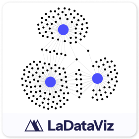
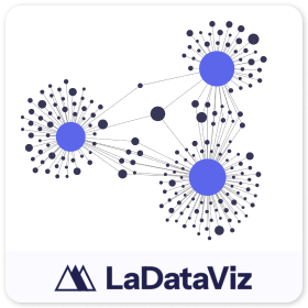
Network 2.0
작성자: LaDataViz
설명
Tableau용 Network 확장 프로그램 소개
데이터 내의 연결과 관계를 강조하도록 설계된 강력한 비주얼리제이션 도구인 Tableau용 Network Chart 확장 프로그램을 사용하여 분석의 수준을 높이십시오. 이 확장 프로그램은 Tableau에 완벽하게 통합되어 사용자가 복잡한 시스템의 기본 구조를 나타내는 상세한 대화형 네트워크 다이어그램을 만들 수 있도록 지원합니다.
Network 2.0에 포함된 여러 새로운 업데이트:
- 원본, 대상 또는 둘 모두에 색상을 추가할 수 있는 새로운 색상 마크 카드!
- 필드를 사용하여 링크의 크기를 지정하는 기능
- 원본 및 대상 크기에 서로 다른 필드를 사용하는 옵션
네트워크 차트를 사용해야 하는 이유 네트워크 차트는 소셜 네트워크의 개인, 인프라의 구성 요소, 데이터 구조의 항목 등 엔터티 간의 관계를 탐색하고 표시하는 데 매우 유용합니다. 이 다이어그램은 상호 연결에 대한 시각적 맵을 제공하여 사용자가 데이터 요소가 서로 어떻게 상호 작용하고 영향을 미치는지 이해하는 데 도움을 줍니다.
Network Chart 확장 프로그램의 기능:
- 포괄적인 비주얼리제이션: 복잡한 관계와 네트워크 구조를 이해하기 쉽고 시각적으로 매력적인 형식으로 표시합니다.
- 동적 상호 작용: 확대/축소, 이동, 클릭 가능한 노드와 같은 기능을 사용하여 네트워크를 탐색하고 특정 연결 세부 정보를 드릴다운할 수 있습니다.
- 원활한 통합: Tableau 에코시스템 내에서 원활하게 작동하여 고급 네트워크 비주얼리제이션 기능으로 기존 대시보드를 향상합니다.
- 높은 사용자 지정 기능: 노드 크기, 가장자리 두께, 색상 등을 조정하여 프레젠테이션의 미적 요구 사항을 충족하거나 데이터의 특정 측면을 강조할 수 있습니다.
데이터 분석가, 연구원, 비즈니스 인텔리전스 전문가에게 이상적인 이 도구는 관계 역학에 대한 심층적인 이해를 도와 포괄적인 시각적 증거를 바탕으로 전략적 의사 결정을 내릴 수 있도록 도와줍니다.
최신 소식! 매주 비주얼리제이션 확장 프로그램 및 기타 도구에 대한 업데이트를 보내드립니다. https://newsletter.ladataviz.com/
- 웹 사이트: https://www.ladataviz.com
- Twitter/X: https://twitter.com/ladataviz
- Youtube: https://www.youtube.com/@ladataviz
- LinkedIn: https://www.linkedin.com/in/ladataviz/
- 그 외 모든 링크: https://linktr.ee/ladataviz
기술 사양
- 호스팅되는 위치
- https://extensions.ladataviz.com/network_v2?licenseKey=free
- 지원 대상
- Tableau 2024.2 이상
리소스
LaDataViz의 추가 정보
.png&w=256&q=75)
Sankey - Draggable
작성자: LaDataViz
멋진 생키 다이어그램을 만들고 노드를 이동하여 완벽한 레이아웃을 만들어 보십시오!

Tree Diagram 2.0
작성자: LaDataViz
데이터를 보기 좋고 통찰력 있는 방사형, 수평 또는 수직 트리 다이어그램으로 변환하십시오.
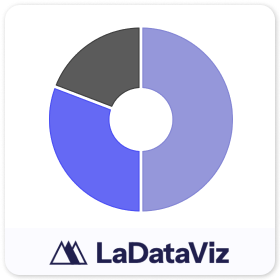
Donut
작성자: LaDataViz
해킹 없이 도넛 차트를 만드십시오!
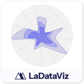
Radar 2.0
작성자: LaDataViz
몇 초 내에 보기 좋고 통찰력 있는 레이더 차트 만들기
Tree Diagram
작성자: LaDataViz
데이터를 보기 좋고 통찰력 있는 방사형, 수평 또는 수직 트리 다이어그램으로 변환하십시오.
Drill Down Filter - Demo
작성자: LaDataViz
대시보드에 고급 드롭다운 필터 메뉴를 2분 만에 추가
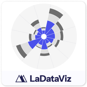
Polar Area Chart
작성자: LaDataViz
데이터를 아름답고 통찰력 있는 Polar Area 차트(Coxcomb / Nightingale Rose)로 변환
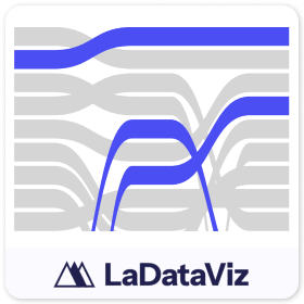
Bump Chart
작성자: LaDataViz
데이터를 보기 좋고 통찰력 있는 범프 차트로 변환하십시오.
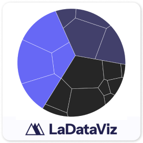
Voronoi Treemap
작성자: LaDataViz
데이터를 보기 좋고 통찰력 있는 보로노이 트리맵으로 변환하십시오.
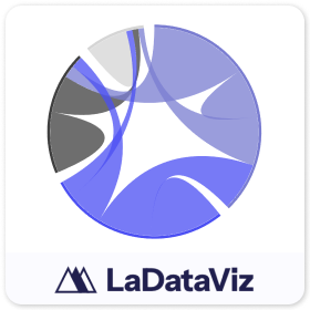
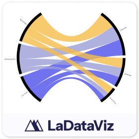
Chord Diagram
작성자: LaDataViz
데이터를 보기 좋고 통찰력 있는 코드 다이어그램으로 변환하십시오.

Radar
작성자: LaDataViz
데이터를 보기 좋고 통찰력 있는 레이더 차트로 변환하십시오.
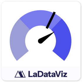
Gauge
작성자: LaDataViz
데이터를 보기 좋고 통찰력 있는 게이지 차트로 변환하십시오.

Beeswarm
작성자: LaDataViz
데이터를 보기 좋고 통찰력 있는 Beeswarm으로 변환하십시오.
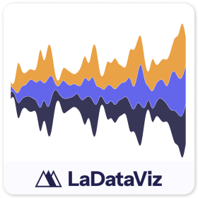
Streamgraph
작성자: LaDataViz
데이터를 보기 좋고 통찰력 있는 Streamgraph로 변환하십시오.
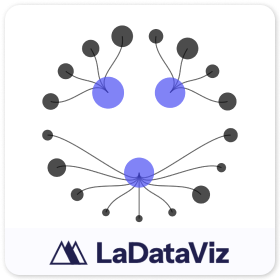
Network
작성자: LaDataViz
데이터를 보기 좋고 통찰력 있는 네트워크 다이어그램으로 변환하십시오.
Radial Sankey
작성자: LaDataViz
데이터를 보기 좋고 통찰력 있는 방사형 생키로 변환하십시오.