

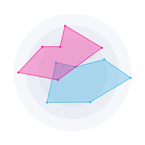
Radar Chart
299c-表:by Infotopics | Apps for Tableau|桜
99e5-表:Description|桜
Radar Chart is useful for side-by-side profile comparison when each entity has multiple metrics on a shared scale. It highlights balanced versus skewed performance and makes shape differences visually memorable.
Radar Chart is great for scorecards, capability assessments, product benchmarking and team performance snapshots. It helps users spot strengths, weaknesses and trade-offs quickly.
Key features
- Toggle colour legend, axis labels and axis measure labels independently.
- Configure axis behaviour with custom axis min/max, tick marks and reverse axis.
- Control shape styling with area opacity, stroke width and circle radius.
- Optional average layer and optional axis-to-centre lines with separate width/opacity controls.
- Set axis line curvature (%) for rounded or straighter profile edges.
- Advanced colouring for axis, grid, average layer, axis lines and axis-label-by-dimension mode.
Get started!
Radar Chart is part of the Show Me More extension collection for Tableau.
Learn more about Show Me More here.
Licensing
This version is free for Tableau Public and Tableau Desktop.
For Tableau Server and Tableau Cloud, we also offer a free model for up to 5 users.
Learn more here.
Stay up to date!
Contact: support@appsfortableau.com
Website: https://appsfortableau.infotopics.com/
Socials: LinkedIn – X – YouTube
e3b3-表:Tech Specifications|桜
- 86eb-表:Hosted at|桜
- https://extensions.tableauusercontent.com/sandbox/show-me-more/smm-radar.html
- 73e6-表:Works with|桜
- 2214-表:Tableau 2024.2 and later|桜
6d57-表:Resources|桜
Download and start your free trial of Tableau today.
Try Tableau Now